







Calendar Color Coding: Practical Frameworks for 2026
Master calendar color coding with accessible palettes and setup tips for Google, Outlook, and Apple Calendar.
You open your calendar and every block looks the same. Meetings blur into focus time, errands sit beside deadlines, and a day that should feel manageable turns into a gray strip you can’t read fast enough. Calendar color coding is the cheapest fix for that problem, because it changes how your schedule reads without asking you to rebuild your life or learn a new app.
The Moment Your Calendar Becomes a Wall of Gray
I see this most often when someone has tried to be “organized” by putting everything in one place, then never gave the calendar a way to distinguish one kind of commitment from another. The result is a screen full of identical rectangles, and the brain does what it always does under visual clutter, it stops scanning and starts guessing. That’s when appointments get missed, work expands into personal time, and the day feels booked before it even starts.
A color system fixes that at the lowest possible cost. You’re not changing the event itself, you’re giving your eye a fast cue for what each block means, and that makes the calendar easier to use at a glance. If your schedule already lives in Google, Outlook, or Apple Calendar, you can start with what you have, then refine it later as needed. A practical starting point is to treat color as a readability tool, not a decorative habit, which is why a simple setup often beats a fancy one.
The rest of this guide stays close to that idea, simple systems first, then more layered frameworks only if they help. If your calendar still feels like a wall of gray after you’ve cleaned up your structure, calendar organization tips can help you reduce the clutter before you assign a single color.
Practical rule: if you can’t tell why a color exists in under a second, that color is probably doing too much work.
What Calendar Color Coding Does
Calendar color coding is a visual metadata layer attached to your schedule. A calendar item still has the same time, title, and location, but color adds a second signal that tells you what kind of commitment it is, who it belongs to, or how you should treat it. That is why color is useful in busy systems. It turns a flat list into something your brain can sort without reading every word.
There are two levels people often mix up. Calendar-level colors apply to an entire calendar feed, so every event from that source shares one color unless you change it later. Event-level colors override a specific item, which is useful when one meeting needs to stand out from the rest of the calendar it came from. In practice, the distinction matters because a color can describe a source, a category, or a one-off exception, and those are not the same thing.
Google’s system shows how structured this has become. Its Calendar API documents 24 preset calendar colors and 60 event colors, with standard and background variants exposed as hexadecimal values in the API reference for colors, which shows that color coding is part of the platform’s schedule data model (Google Calendar API colors). A constrained implementation can also use named swatches instead of free-form colors. Google Apps Script’s Calendar Color enum documents 18 named colors, including BLUE (#2952A3), GREEN (#0D7813), RED (#A32929), and TEAL (#28754E), which helps explain why imported calendars often need color normalization when they move between systems that do not share the same palette (Google Apps Script Calendar Color enum).
A clean color system works like a label maker for your week. It does not change the meeting itself, but it gives you a quicker way to decide what deserves attention, what can wait, and what should stay visually quiet. That becomes even more useful in coordination-heavy work, where defining project coordination helps separate calendar clutter from the events that need action.
Practical rule: use color for the question you ask most often, not for every detail you can possibly encode.
Five Coding Frameworks You Can Borrow Today
The easiest mistake is treating color as one universal system. It isn’t. A useful palette starts with the decision you want to make faster, then picks the smallest set of colors that supports that decision. That’s why the best framework depends less on taste and more on what you need to see when your week gets crowded.
By calendar
This is the cleanest starting point. Give each source calendar its own color, such as work, personal, family, client projects, or shared team schedules. It works when your main problem is source confusion, especially if you check multiple calendars every day.
By role
This framework assigns color by who owns the commitment, not where it came from. For example, client, internal team, and personal events can each get their own color so you can separate external obligations from in-house work. It’s especially useful when your schedule is full of coordination work and you need a quick way to protect your own bandwidth.
By priority
Use this when urgency matters more than category. A high-priority event can stand out in red, while normal items stay in a calmer color and low-priority items recede. This is most effective for project calendars and launch timelines, where the question is, “What needs action first?”
If you want a useful way to think about coordination before assigning these roles, defining project coordination is a strong reference point because it frames schedules as dependency management, not just event storage.
By context
This is the most useful framework for people who protect focus time. Deep work, meetings, admin, and recovery each get their own color so you can see the shape of your day before it starts. It works well when your calendar includes different energy demands, not just different tasks.
By time-blocking
Use color to mark the type of block, such as focus blocks, communication windows, breaks, or admin slots. That makes your calendar act like a plan, not just a record. It’s the best fit when you already time-block and want the blocks to be visually distinct without adding extra labels.
A clean combination is usually enough, not a full visual language. For example, one framework can describe the source of the event, while a second one describes the priority or context, but adding a third layer usually makes scanning slower instead of faster.
Accessible Color Palettes That Read at a Glance
People usually choose colors they like first, then discover those colors stop working once the week fills up. A palette has to survive a glance on a small screen, a bright office light, and the kind of tired review session where every shade starts to blur together. That is why accessible palettes matter more than stylish ones.
A good palette does one job well. It keeps categories distinct without making the calendar hard to scan, and it still makes sense after you have looked at it for a while.
High contrast palette
This style works best when you check your calendar on a phone, move quickly between apps, or need strong separation between categories. Use clear differences and avoid shades that sit too close together.
- Blue for work, #2952A3
- Red for urgent items, #A32929
- Green for personal or routine items, #0D7813
- Teal for meetings or coordination, #28754E
The value of this approach is simple. Each color carries its own weight, so the calendar reads quickly even when the day is crowded.
Muted palette
A softer palette is easier on the eyes during long planning sessions. It gives you separation without making the calendar feel loud, which helps if you spend a lot of time in weekly review mode. Use muted tones when you want the system to sit unobtrusively in the background until you need it.
- Soft blue for work
- Soft green for home
- Soft red for deadlines
- Soft purple for wellness
This style works like low-volume lighting in a room. The shapes are still there, but they do not compete with the rest of your attention.
Color-blind-safe palette
This approach depends on stronger hue separation, especially blue, orange, and yellow contrasts. It works best when multiple people will view the same calendar or when you want a palette that stays readable under different visual conditions. Keep the number of categories modest so the contrast stays meaningful.
A fixed swatch set can help here. Google Apps Script’s 18-color enum is a reminder that limited choices often make color systems more consistent across devices, even when different calendar tools handle colors in different ways. In plain terms, fewer choices can be easier to keep aligned than a richer palette that looks good in one app and drifts in another. If you want a practical Google-specific reference, Google Calendar color guidance covers the setup side in more detail.
Practical rule: if two colors look similar at a glance, they are too close to carry separate meaning.
Setting Up Color Coding in Google, Outlook, and Apple
The fastest setup is the one that matches the app you already open first. Google, Outlook, and Apple each handle color a little differently, so the goal is to set a pattern you can maintain without hunting through menus every day. The details matter here, because a nice palette means nothing if you can’t apply it consistently.
Google Calendar
Start by creating separate calendars for categories that rarely overlap, then assign each one a color. That gives you fast, calendar-level control before you ever touch event-level colors. For individual events, use the event color menu so one off item can stand out without changing the whole calendar.
Google Calendar also supports keyboard-driven event creation in the web app, which makes it easier to keep color-coding attached to fast capture habits. The practical move is to create the event first, then color it immediately while it’s still fresh. That reduces the chance that uncolored events pile up and flatten your system.
For a more detailed walkthrough of the Google-specific workflow, use Google Calendar color guidance as a companion reference.
Outlook
Outlook works well when you think in categories. Create your category names first, then map each one to a color so the same rule can apply across recurring events and new items. The Quick Click option is useful when you want one category to be the default action you apply most often.
Outlook’s color rules can also auto-apply based on subject keywords, which helps when a meeting title consistently contains the same trigger word. That keeps your system from depending on memory alone. Verify the setup by opening a few sample items and checking that the category color appears the same way every time.
Apple Calendar
On macOS and iOS, Apple Calendar is strongest at per-calendar colors. That makes it clean for source-level separation, especially if your iCloud calendars already split work, family, and personal time. Event-level color control is less granular than what Google and Outlook users often expect, so Apple works best when the calendar structure itself carries most of the meaning.
If your iPhone and iPad are signed into the same iCloud calendars, those colors should reflect across devices in the same account set. The quick check is simple, open the same calendar on each device and confirm the same source calendar still reads as the same color. If it doesn’t, the issue is usually account mapping, not the color idea itself.
If you want one tool that can keep availability aligned across Google, Microsoft Outlook or Office 365, and Apple Calendar while letting you mask sensitive fields, SyncThemCalendars is one option to consider for multi-calendar synchronization.
When More Colors Actually Hurt Your Schedule
A more elaborate palette feels more polished, but it doesn’t always work better. Once you push beyond a manageable number of hues, the eye slows down, and the calendar becomes harder to read than a simpler version with fewer distinctions. That’s why the popular 5 to 7 color limit shows up in design advice, because too many colors turn into visual noise rather than fast recognition.
The question isn’t whether you can assign another color. It’s whether the added color helps you decide anything faster. If you need a legend to decode your own calendar, the system has probably crossed the line from useful to overbuilt.
A simpler setup often wins in day-to-day use.
- Two-color availability plus labels can be enough if your main need is separating open time from booked time.
- One color per source calendar is usually better than a crowded category system when you’re juggling many accounts.
- Priority-only coloring works when everything else is already clear from titles and timestamps.
That approach is especially useful for people who start with enthusiasm, then quit because the maintenance cost rises faster than the benefit. A good pruning test is whether you’ve used a color intentionally in the last couple of weeks. If not, it’s not part of the system, it’s clutter.
Keeping Colors Consistent Across Synced Calendars
Color gets complicated the moment events move between platforms. A careful Google palette can shift when it lands in Outlook or Apple because each system treats color differently, and the receiving app may normalize it to its own defaults. That’s why imported or mirrored calendars often look “close enough” instead of identical.
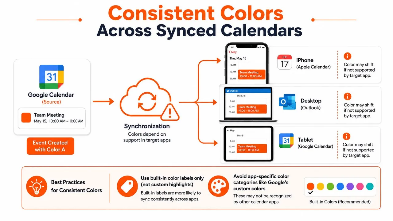
If you’re syncing across Google, Microsoft Outlook or Office 365, and Apple Calendar, the safest practice is to preserve the source calendar color where possible and avoid relying on custom highlights that only one app understands. A service like SyncThemCalendars can synchronize events in real time, mirror free/busy availability, and mask fields like title, description, and location before they reach another calendar, which helps keep private events controlled while still reducing double-bookings. It also supports color-aware filtering and lets users distinguish synced events from organic ones, which is useful when you want mirrored items to stay visually separate from manually created entries.
For a deeper technical walk-through of the sync process, how to sync Google Calendar is a good reference point.
Privacy works best when you treat color as a display layer, not as a place to store sensitive meaning.
A Starter Template and a Two-Minute Weekly Habit
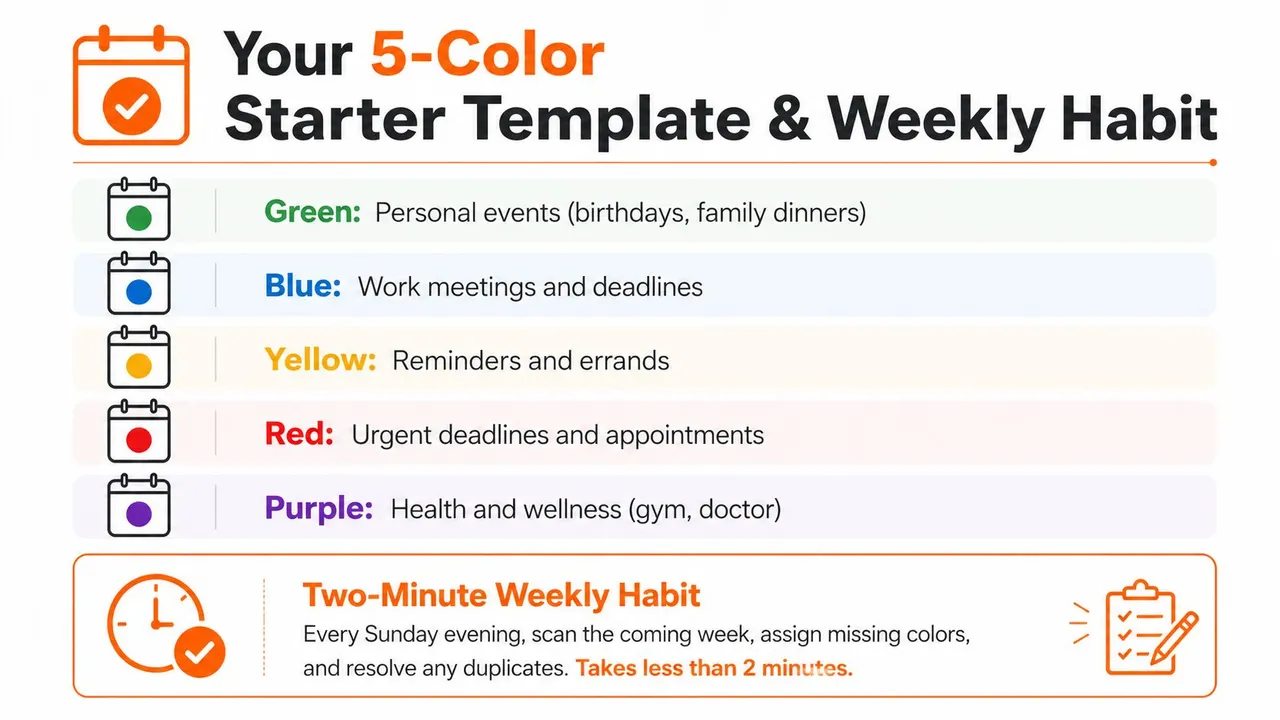
Use this starter set if you want a system you can install quickly and trust immediately.
- Green for personal events, birthdays, and family dinners.
- Blue for work meetings and deadlines.
- Yellow for reminders and errands.
- Red for urgent deadlines and appointments.
- Purple for health and wellness.
Spend one 30-minute session assigning those colors to your main calendars, then color only the events that break the pattern. On Sunday evening, scan the next week, fill any missing colors, and remove duplicates that no longer earn their place. The rule that keeps the whole system sustainable is simple, every color must answer one question you ask your calendar.
SyncThemCalendars helps keep calendars aligned across Google, Outlook, and Apple without forcing you to rebuild your system from scratch. If color coding matters to you because it helps you separate work, personal time, and private details, visit SyncThemCalendars to see how synced calendars can stay readable and controlled across accounts.
Ready to sync your calendars?
Keep your Google, Outlook and Apple iCloud calendars in sync automatically. 2-minute setup, no credit card required.
Get started freeKeep reading
More in Tips
Sync Google Calendar with Office 365 Made Simple
Learn how to sync Google Calendar with Office 365 reliably. Compare native, subscription and real-time sync options with setup steps and privacy tips.
Prevent Double Booking Calendar: Essential Tips for 2026
Learn how to prevent double booking calendar conflicts with smart scheduling tools and best practices for a seamless workflow in 2026.
Two Way Google Calendar Sync: Setup Guide and Best Practices
Master two way Google Calendar sync with step-by-step setup, privacy controls, and troubleshooting tips for entrepreneurs, freelancers, and teams.